#1- Toronto Blue Jays Current Logo 2012-
Fans got fed up of how they couldn't give this team a "modernized" look. They loved the old look a lot and why not, it reminds them of when they won the World Series. Also, this gives the team the nostalgic look that they miss because Canada didn't like the other looks that they had for the Blue Jays. Now Blue Jay fans feel like they can buy their merchandise again and support the team even more now and have pride in it.
#2- Milwaukee Brewers Logo 1978-1993
This logo was popular because of the fact that it had that late 1970's look with the beer looking yellow and the 1970's looking blue. Even the baseball in the middle looked 1970'sish. This logo is clever because of how it looks like a baseball glove but if you look closely, it has the M where the fingers would go and the B for where the thumb and palm of the hand would go and wouldn't you know, there's a baseball in the mitt, which makes a lowercase b. This logo is popular too due to the fact that it reminds fans of the days of Robin Yount, Paul Molitor and Cecil Cooper of when they won the American League Championship in 1982.
#3- Toronto Blue Jays 1977-1996
This logo is a favorite amongst Blue Jay fans due to the fact that they saw the most success in this logo, making it nostalgic among the fanbase. They won 2 World Series Championships with this logo, during the days of Joe Carter, Roberto Alomar, John Olerud and Juan Guzman. Also, the other logos that the Blue Jays have had weren't made that well. The only reason why they changed their logo in 1997 is because MLB wanted them to have a more modernized look.
#4- Florida Marlins Logo 1993-2011
When the MLB awarded the South Florida area an expansion team in 1993, the people that created this logo did a good job in it. First of all, that's a clever way for the marlin to be represented in the logo, it flying up, tall and proud with the lettering at an angle with the baseball in the middle of that circle. The colors, for the time this logo was made also were popular with the 1990's looking teal with the 1990's looking reddish-orange for the seams of the baseball. With this logo, the Florida Marlins won 2 World Series Championships in 1997 and 2003 with players like Gary Sheffield, Moises Alou, Kevin Brown, Luis Castillo, Alex Gonzalez and Dontrelle Willis.
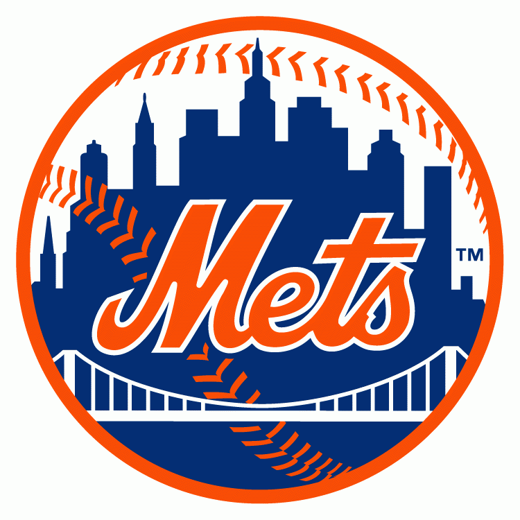
#5- New York Mets Current Logo 1999-
When do you ever find a logo that represents a city better than this one? This logo consists of the official colors of New York City, blue and orange, which also represents the two original baseball teams in New York City, the Brooklyn Dodgers and the New York Giants. In this logo, it has a bridge and a skyline that looks like a setting in New York City, which gives New Yorkers pride in this team. Fans will also remember the days of Mike Piazza and Al Leiter on the 2000 National League Championship team with this logo.
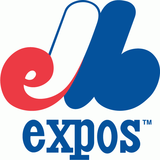
#6- Montreal Expos Logo 1992-2004
This logo was so popular that people are literally begging for this nostalgic franchise to come back to the MLB. This logo got a more modernized look to suit the MLB for the 1990's with more modernized lettering of Montreal Expos around a circle with the Expos emblem in the middle with a baseball in the background, which creates a logo that gives baseball fans fond memories of this franchise.
#7- Montreal Expos Logo 1969-1991
This logo is a fan favorite because this logo reminds baseball fans and people from Montreal of the days of the Montreal Expos and of the nostalgia that this franchise brought. This logo was cleverly made because it's in the shape of the letter M for Montreal but you can tell at the beginning, there's a lowercase e for Expos and there's a lowercase b for baseball. This logo is decorated in the 1970's looking red, white and blue.