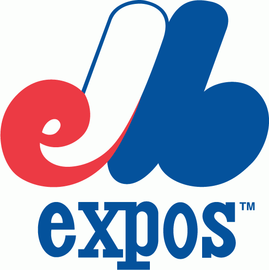
This logo is a fan favorite because this logo reminds baseball fans and people from Montreal of the days of the Montreal Expos and of the nostalgia that this franchise brought. This logo was cleverly made because it's in the shape of the letter M for Montreal but you can tell at the beginning, there's a lowercase e for Expos and there's a lowercase b for baseball. This logo is decorated in the 1970's looking red, white and blue.
No comments:
Post a Comment